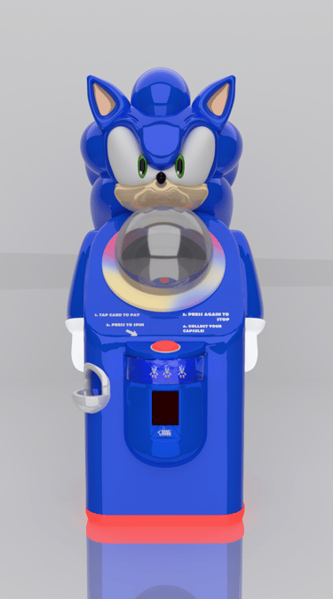
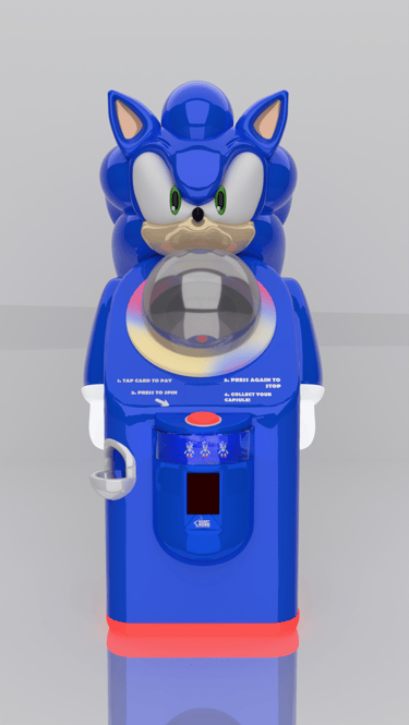
The problem:
The solution:
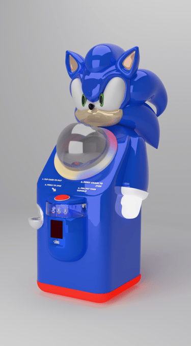
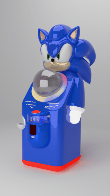
Licensed character designs often risk becoming overly decorative, where strong visual identity can interfere with clarity and function. The challenge was to create a Sonic-inspired vending machine that communicates the brand’s energy while remaining readable, balanced, and functional as a real product.
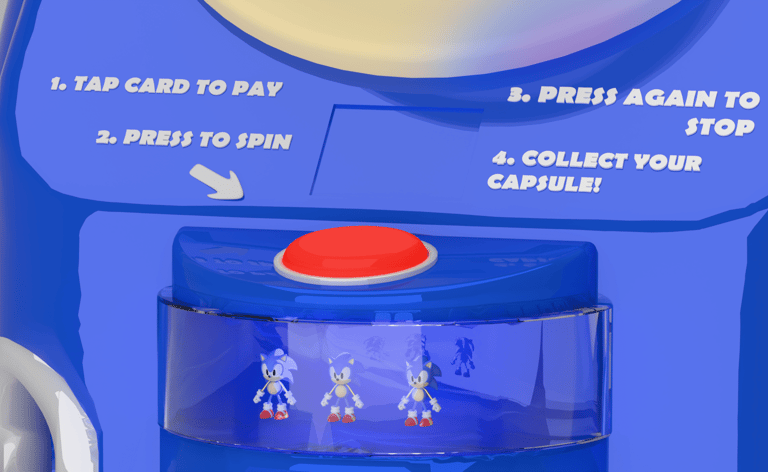
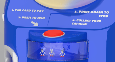
The design uses Sonic’s color palette, motion cues, and recognizable shapes in a controlled way, prioritizing clear product visibility and interface placement. Dynamic lines and accents suggest movement without overwhelming the structure. This approach keeps the machine usable and visually clear while still expressing Sonic’s fast-paced identity.